Designing the Everglades National Park Poster
Explore the creative journey behind the Everglades National Park poster, showcasing the transition from concept to the final product.

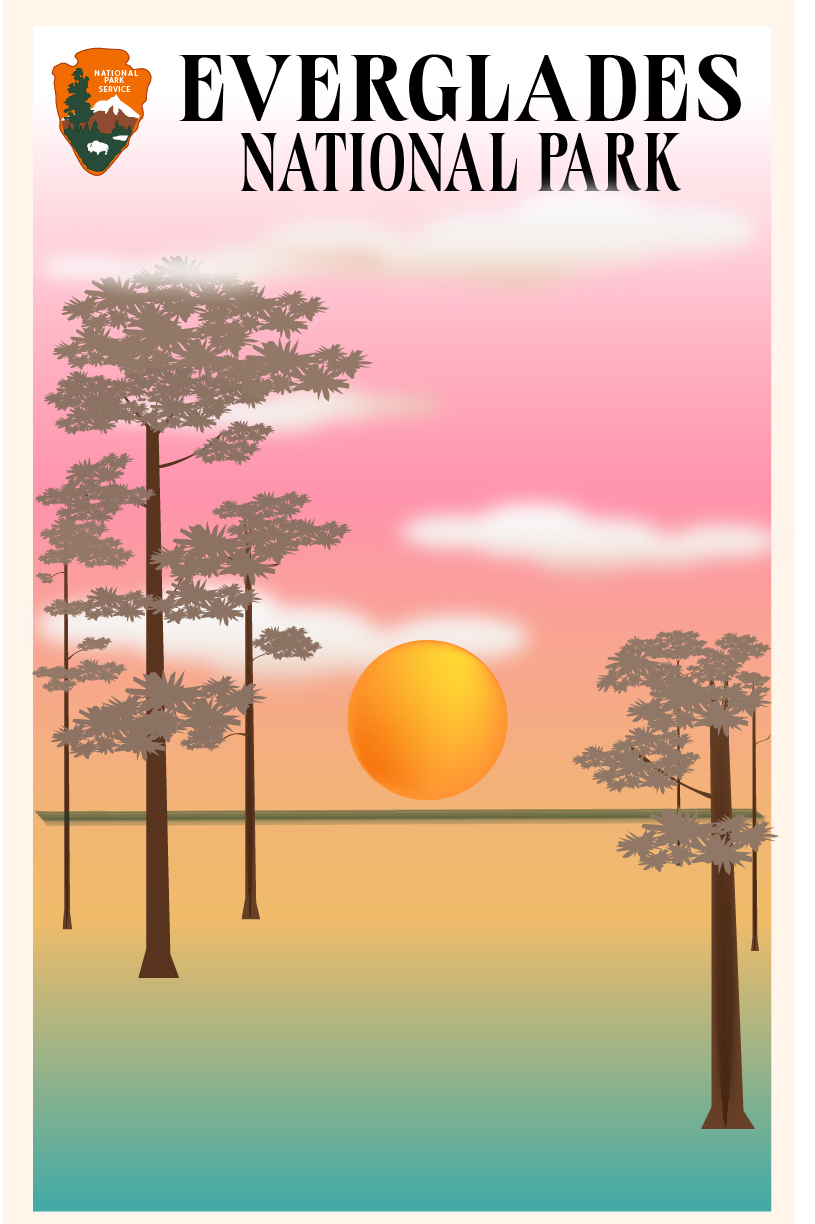
Concept Design: The second image showcases the initial concept design. The goal was to represent the Everglades' unique beauty through soft gradients, warm colors, and natural elements. This design served as the foundation for the final product.

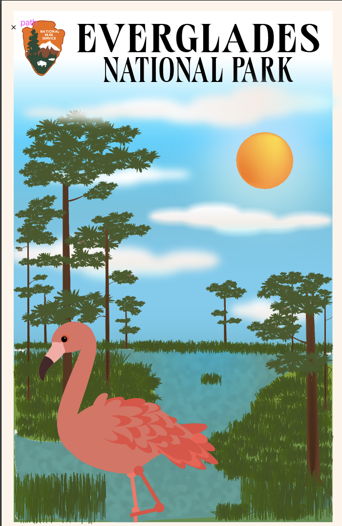
Final Design: This image represents the finished Everglades National Park poster. Vibrant colors, playful elements like the flamingo, and bold serif fonts were used to ensure the design's appeal to a diverse audience.
Artist Statement:
Visual Appeal, Creativity, and Readability
The Everglades National Park poster captivates viewers with its vibrant colors, whimsical elements, and clear readability. The bright orange sun and pink flamingo immediately draw the eye, creating a warm and lively atmosphere. Natural greens and browns enhance the feeling of being in a thriving ecosystem. Creativity is evident in the playful flamingo depiction, and the stylized sun adds a striking focal point. Bold serif fonts ensure readability and high contrast, while the National Park Service logo adds authenticity.
Design Appeal to the Intended Audience
The poster appeals to nature enthusiasts, families, and tourists. Vibrant visuals evoke adventure and exploration, enticing viewers to learn more about the park. The playful flamingo appeals to children, making the design accessible to all ages.
Design Elements:
- Flamingo: A whimsical touch showcasing the local wildlife.
- Sun: A bright, cheerful element symbolizing Florida's warm climate.
- Trees and Water: Representing the Everglades' unique ecosystem.
- Text Font: A bold serif font ensures readability and conveys tradition.
Techniques Used:
- Layering: Adds depth and perspective.
- Color Gradients: Enhances depth and dimension.
- Contrasting Colors: Ensures key elements stand out.
- Simplification: Clean, recognizable shapes for visual appeal.
Final Thoughts: This project highlights the balance between creativity and functionality. From concept to the final design, the poster successfully captures the essence of the Everglades, inviting viewers to appreciate its beauty and explore its wonders.
← Back to Portfolio
